WSU PROMO

Project Brief:
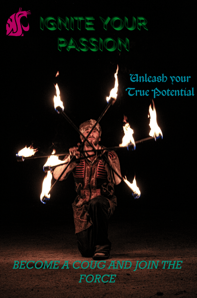
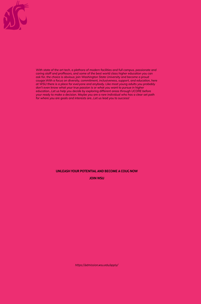
I used a mostly black background for negative space to go good with crimson, reds, and greens used in this promo, allowing the image, logo, and text to stand out more clearly. This project was projected towards potential new WSU students currently or just graduating high school for WSU as a promotion flyer. I used an image that would hopefully catch the eyes of potential prospects with the WSU logo up top for flare and buzz words in fun fonts I believed high school students would dig. I included a paragraph about why you should join WSU (again with target audience in mind), more buzzwords/flare in middle and a link at bottom to apply.

Name and Class:
Inan Harsh
COMM 210-1

Date:
9/20/23

Programs Used:
Lightroom Classic and Photoshop

Design principles:
Here are some points worth highlighting:
Repetition of colors and design (Crimson and red tones to match logo, fire, and outfit. Buzzwords)
Alignment of text and images
Contrast and use of logo
Why you should join and buzzwords

Inspiration:
https://sydneyriggdesigns.wordpress.com/2021/05/02/wsu-promo/
https://app.peachjar.com/flyers/all/schools/38732?sort=title
https://www.instagram.com/p/CSL8uO-j5AL/
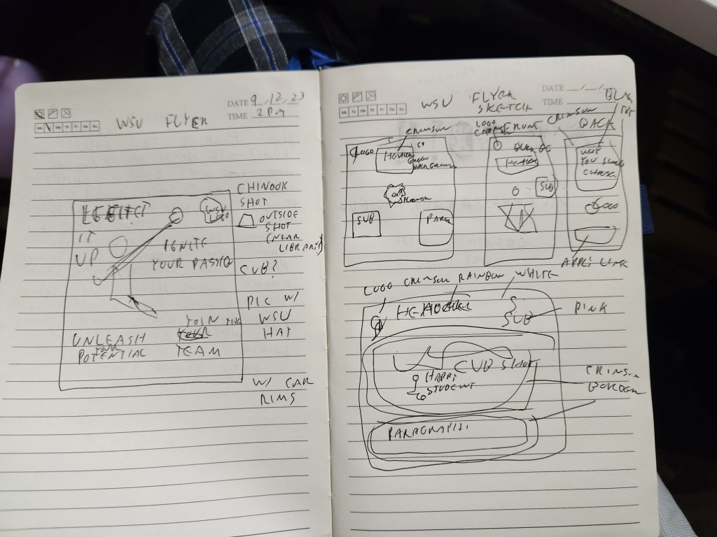
Sketch:

One response to “WSU PROMO”

  1. I really like the background photo, the darkness allows for the subject to be the main focus of the poster. I think the theme is very creative, along with the incentivizing and fun language used. To add some more flair I might add an exclamation point after “join the force”.

    I think there is very good contrast on the first page, like you said the black makes the colors stand out more. The focal point is very clear, it stands out and is centered perfectly. I might consider using a different color for the second page; the pink is kind of bright which makes the text hard to read and also changes the way the color looks on the logo. Another fix could just be increasing the font size.
    I do like how you used bright colors for the fonts, but I think it would look more cohesive if only 2 colors were used instead of 3, it would also create more repetition and pattern. I might also apply that concept to the fonts being used on the first page, all of the fonts are cool by themself, but they don’t really flatter each other, maybe choose one of the eccentric fonts to use and then another one that compliments it.
    I like how you spaced out the text on the second page; the alignment also looks good, the only thing I might worry about is the Coug logo being cut off in both corners. Also on the second page the alignment of the logo is different from the first page. I would say there is a lot of good negative space, however the placing of “unleash your true potential” is a little close to the subject and the edge of the paper. Other than that, I think this was done really well.

    Like

Leave a reply to Elena Trager Cancel reply