CRITIQUE CHECKLIST
Use this checklist as a starting point. Be sure to cover at least these things below- but feel free to go beyond the questions in your critique.
The Good Stuff
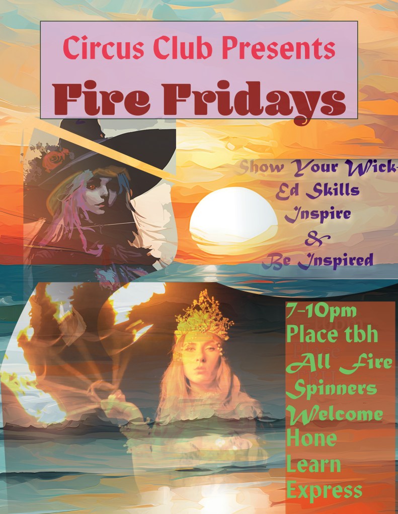
Nice and relevant images, nice alignment and color along with typography. I would say the the upper left image takes up a bit too much space and interrupts some of the word boxes.
Contrast
The blue against orange is nice contrast and matches the theme well
Repetition
Do we repeat fonts? Colors? Styles? Spacing? Alignment?
How can we create stronger repetition?
Typography
Typography is very good and stylish, perhaps the bottoms left could be more consistant

Leave a comment